customers hesitate…
1. Design Plans Around Customer Needs, Not Internal Features
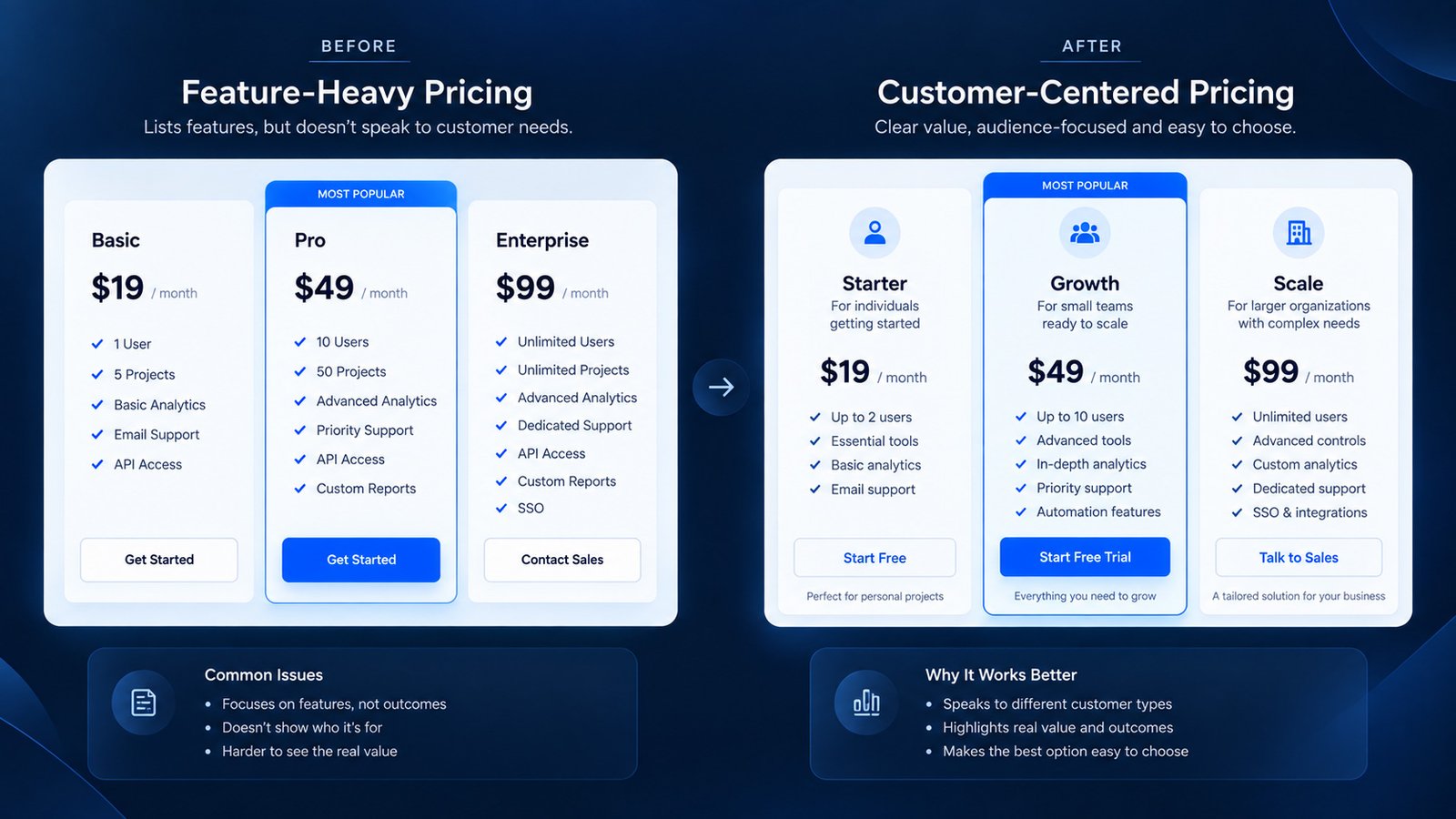
Your pricing structure should reflect how customers think about choosing a plan…
2. Create a Clear Visual Hierarchy Between Plans
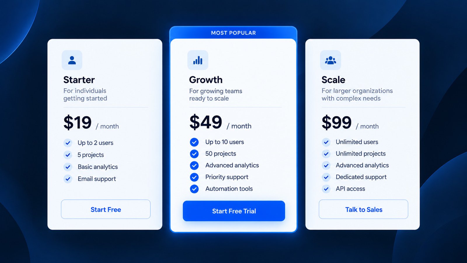
Once the plans are defined, the visual hierarchy should make the decision easier…
3. Make Price and Billing Conditions Immediately Understandable
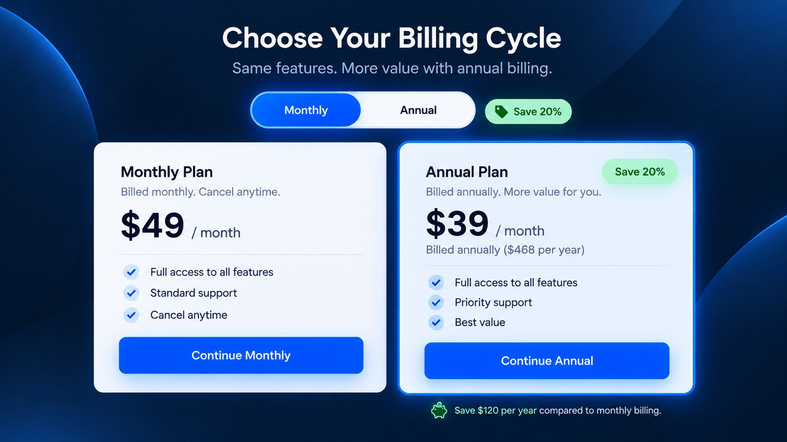
Pricing becomes confusing when visitors cannot immediately understand what they will actually be charged…
4. Highlight Differences Instead of Making Users Compare Everything
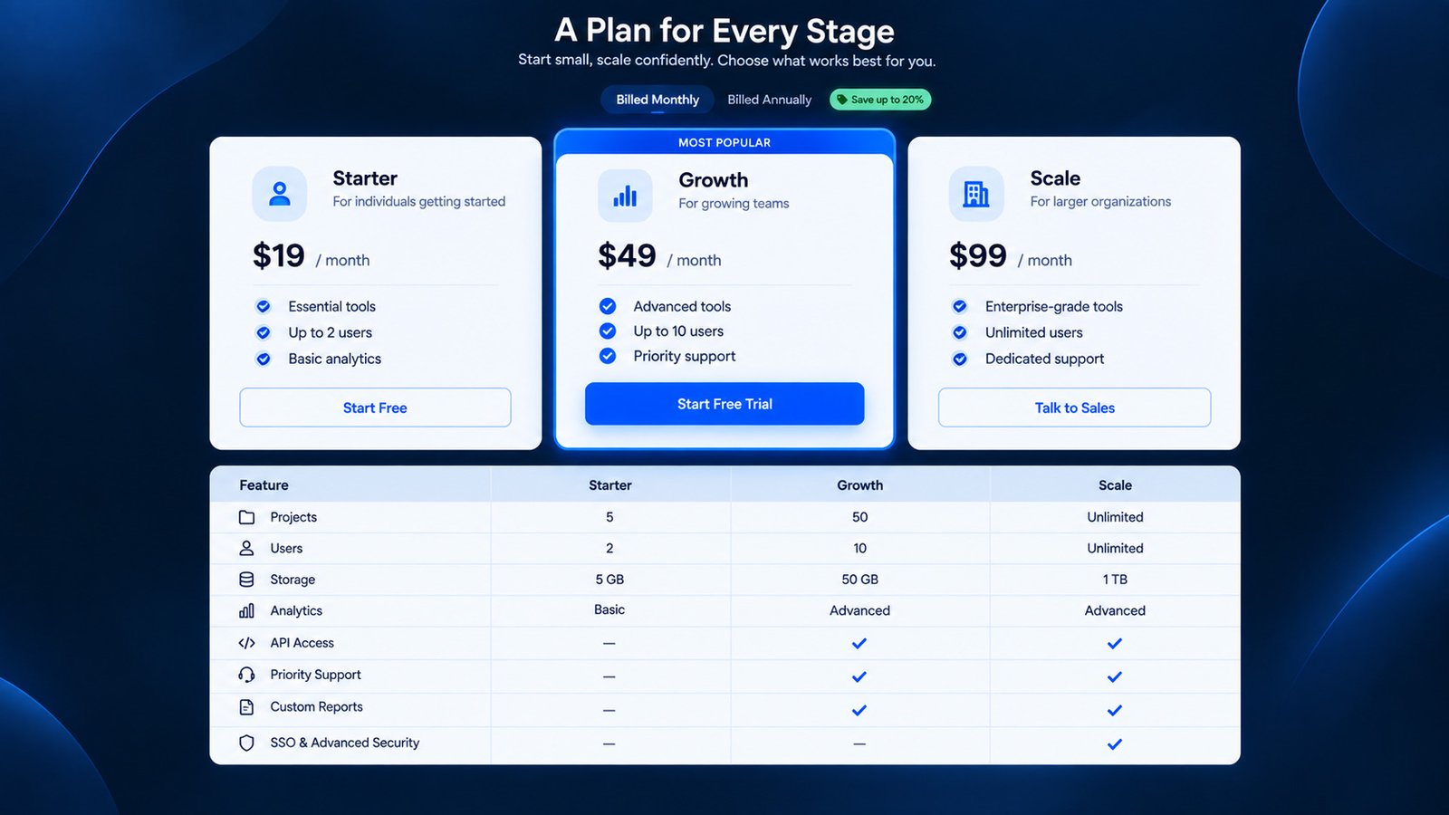
Do not force visitors to compare every feature before understanding the major differences between plans…
5. Use CTA Labels That Match the Customer’s Next Step
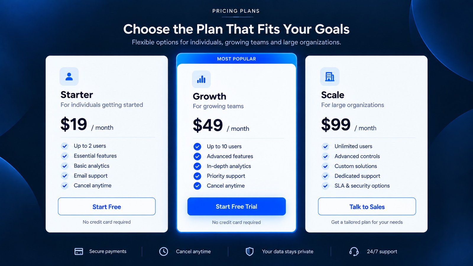
A CTA should tell the visitor what happens next…
6. Explain Why a Customer Should Pay More
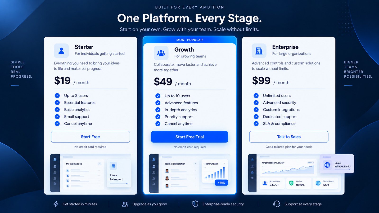
Moving from one plan to another should feel like a logical increase in value…
7. Design the Mobile Pricing Experience as a Decision Flow
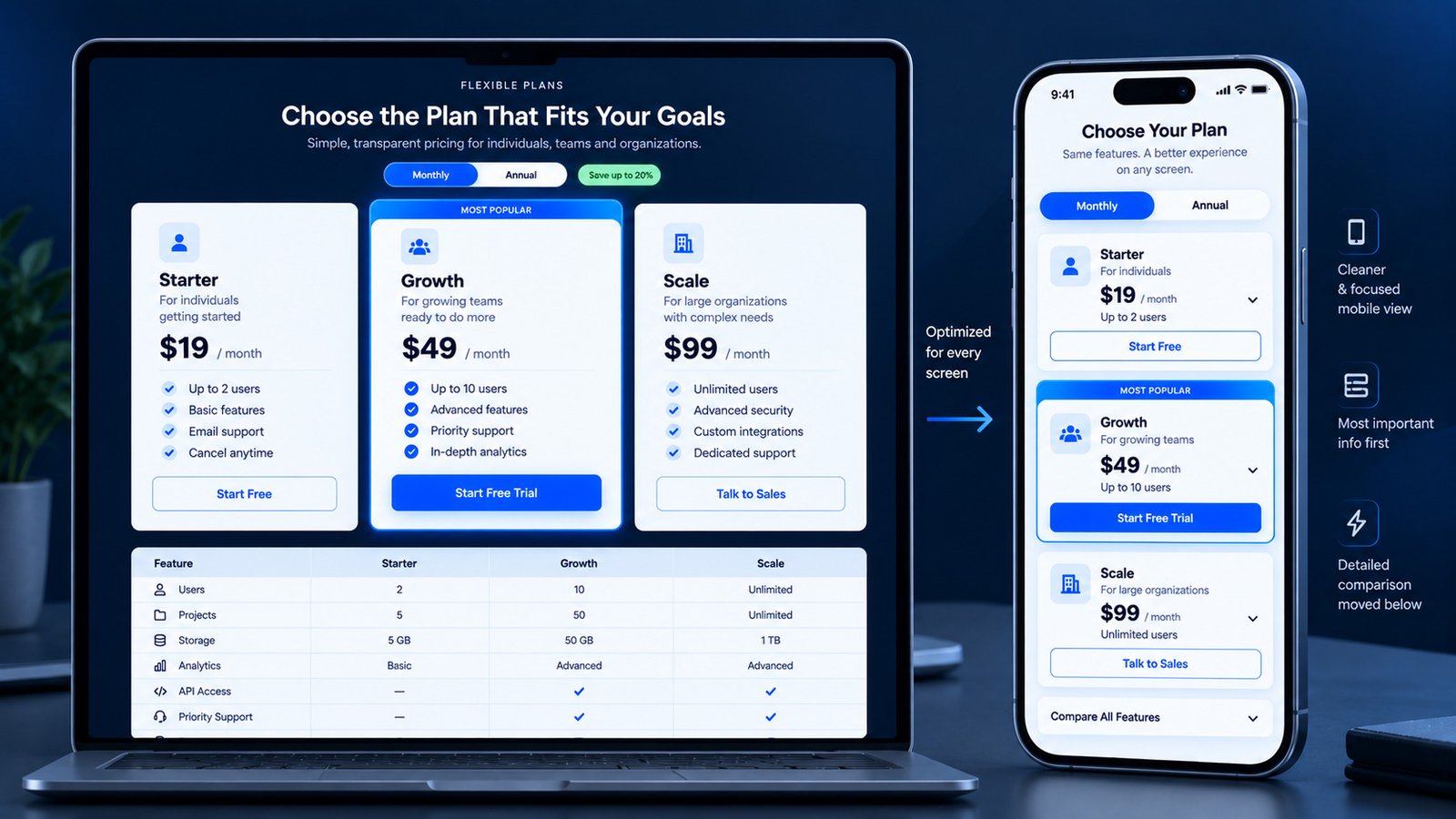
On mobile, the pricing experience cannot simply be a compressed desktop table…
8. Give Users Confidence Before the Final Decision
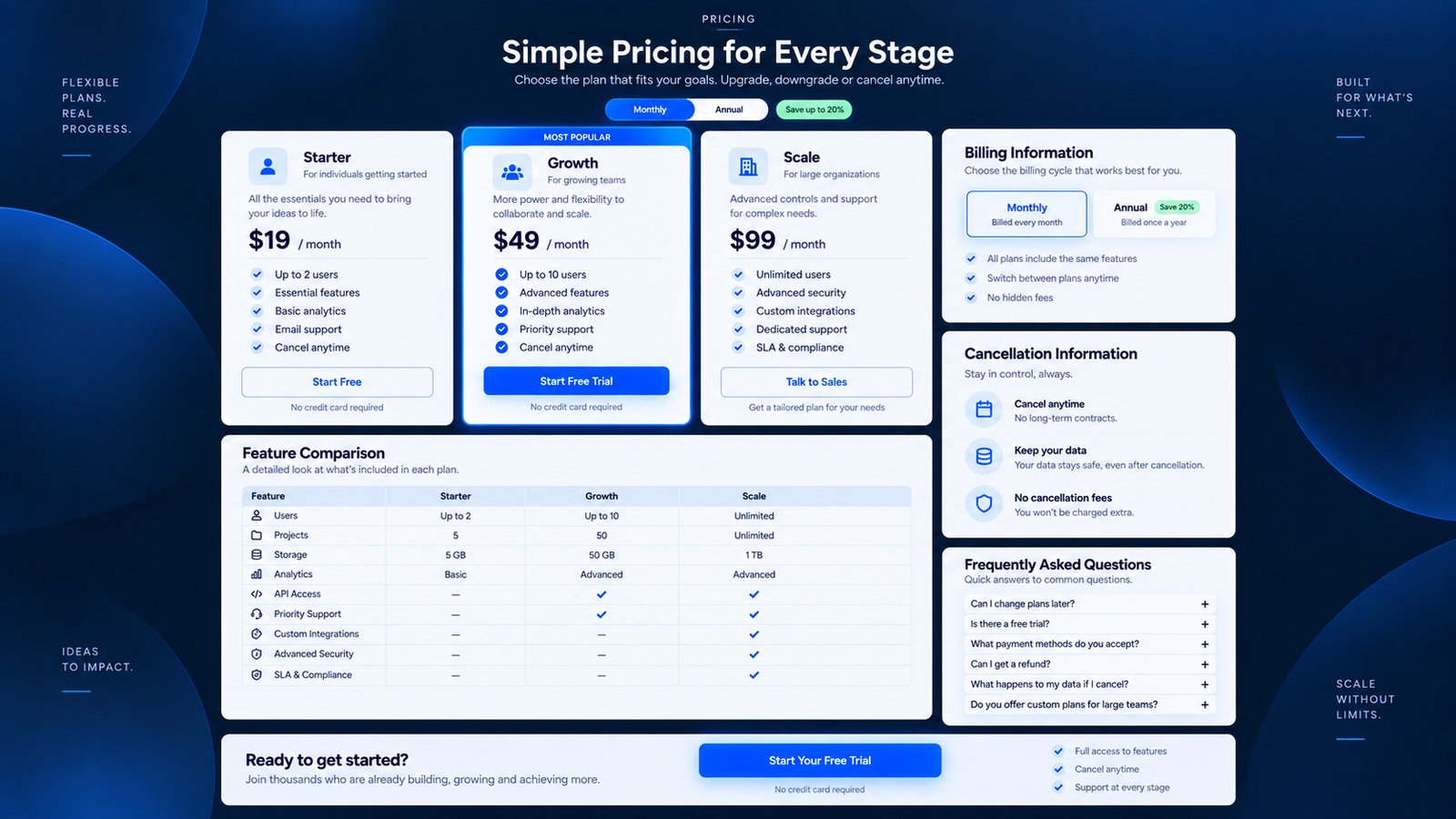
The final part of the pricing experience should remove the remaining doubts before purchase…
Frequently Asked Questions
Make Your Pricing Page Easier to Choose
Good pricing UX is not about showing more information.
It is about helping people make the right decision with less effort.