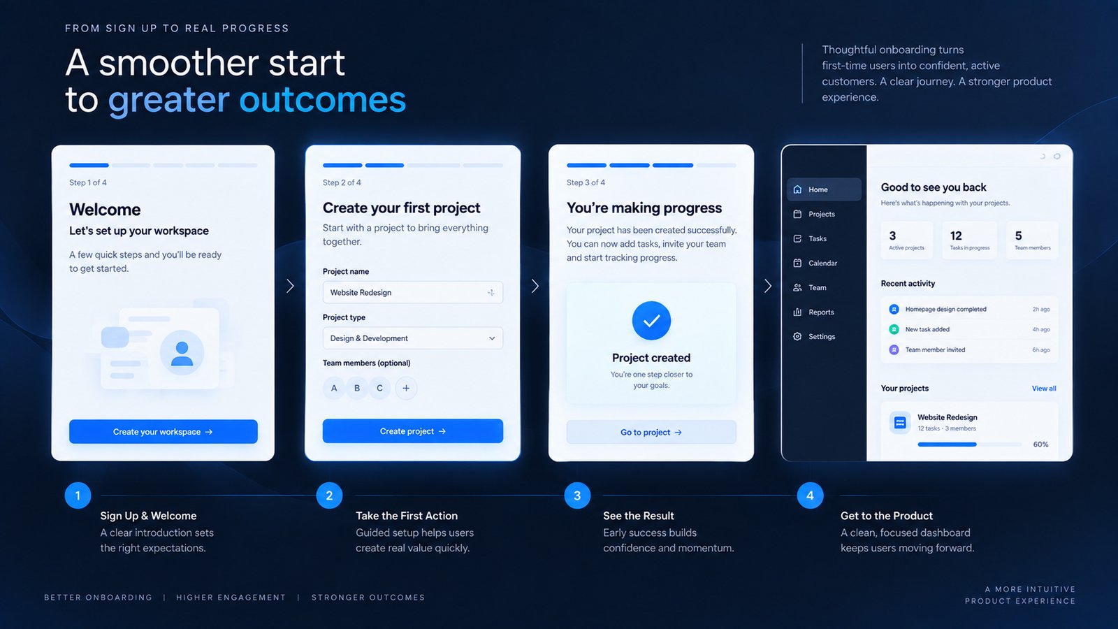
I have seen onboarding flows become longer every time a product team adds another feature.
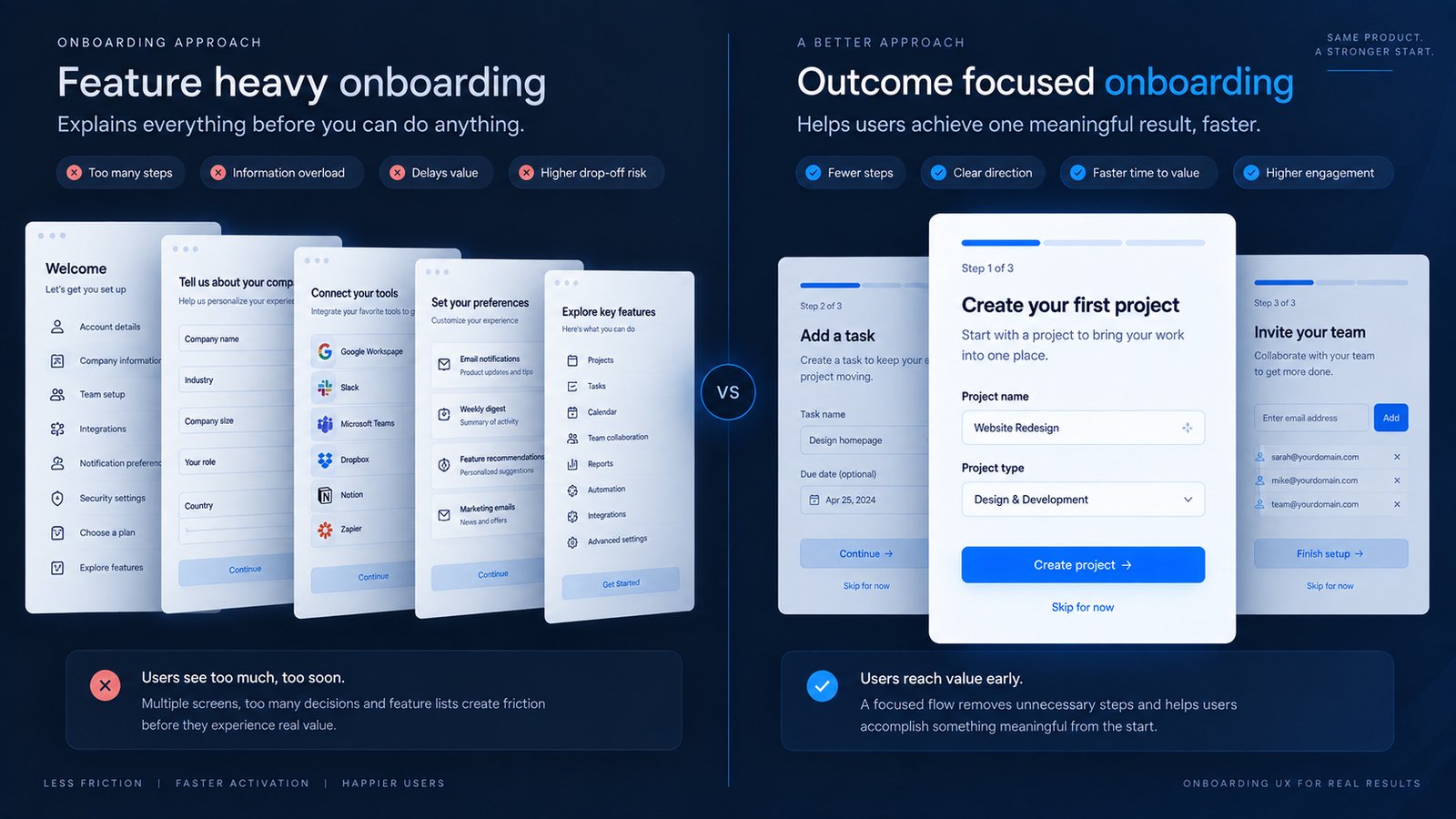
The reasoning usually sounds sensible: explain the dashboard, introduce the navigation, show the settings, collect profile information, recommend features and ask users to configure everything before they can really start.
The result is often an experience that explains the product before allowing the user to experience it.
That is the central problem with weak onboarding UX. A first-time user does not necessarily need to understand the entire product. They need to understand what to do next and why it matters.
For a SaaS product, business application or complex dashboard, onboarding is the bridge between initial curiosity and the first useful outcome. If that bridge is overloaded with instructions, setup requirements and unrelated decisions, the product starts feeling difficult before the user has even used it.
A better approach is to design onboarding around the user’s first meaningful success. The goal is not to teach everything. The goal is to help the user reach the right first outcome with enough guidance to stay confident.
Quick Answer
Effective onboarding UX reduces the distance between a user’s first interaction and a meaningful product outcome by removing unnecessary decisions, introducing guidance at the right moment and creating a clear path into the main experience.
1. Start With the User’s First Meaningful Outcome
The first onboarding question should be: what should this user be able to accomplish after the initial setup?
Design the flow around the user’s current context rather than the complete list of product capabilities. The interface should make the next useful action understandable without requiring the user to learn the whole system first.
Practical Example
A hypothetical project-management product can introduce six features in a tour, or guide a new user through creating one project and assigning the first task. The second route demonstrates value through action.
Senior Designer Observation
A common mistake I see is designing onboarding around the product’s feature hierarchy rather than the user’s first job. The product team thinks, “We need to introduce these features.” The user thinks, “I need to get this thing working.” The second perspective should drive the flow.
2. Ask for Information at the Moment It Becomes Useful
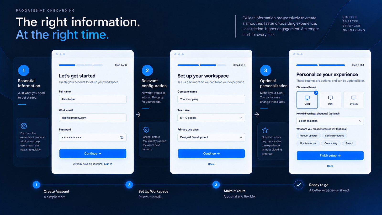
Onboarding often becomes unnecessarily long because teams try to collect everything upfront. The question is whether each piece of information is useful right now.
Design the flow around the user’s current context rather than the complete list of product capabilities. The interface should make the next useful action understandable without requiring the user to learn the whole system first.
Practical Example
Separate onboarding information into “required now,” “useful later” and “optional.” This simple classification often reveals fields that can move out of the first session.
Senior Designer Observation
Do not ask a question before the user understands why you are asking it. Information feels easier to provide when its purpose is connected to the task already in front of the user.
Design Recommendation
Use progressive disclosure. Collect what is necessary for the current step, then introduce additional configuration when the user has enough context to understand its value.
3. Give Users a Clear Sense of Progress
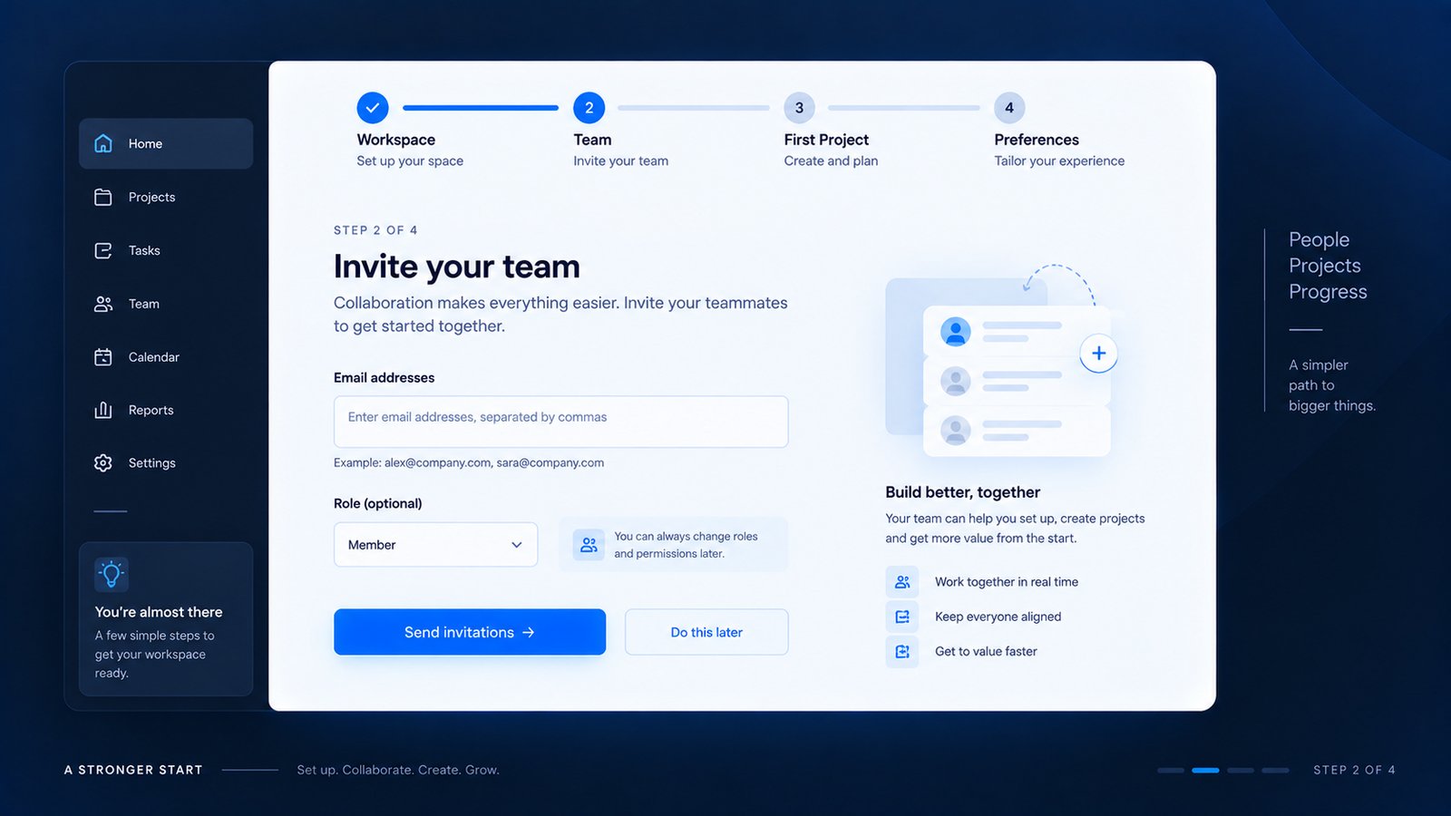
People tolerate multi-step processes more easily when they understand where they are. A five-step setup can feel reasonable when the interface communicates “Step 2 of 5.”
Design the flow around the user’s current context rather than the complete list of product capabilities. The interface should make the next useful action understandable without requiring the user to learn the whole system first.
Practical Example
“Workspace → Team → First Project → Preferences” gives a clearer mental model than a percentage such as “60% complete,” especially when some steps are optional.
Senior Designer Observation
Progress is really about reducing uncertainty. The user should know where they are, what they have completed, what happens next and whether they can return later.
Design Recommendation
Use step names when the stages have meaning. Avoid progress indicators that look precise but communicate very little about the actual work remaining.
4. Use Contextual Guidance Instead of Long Product Tours
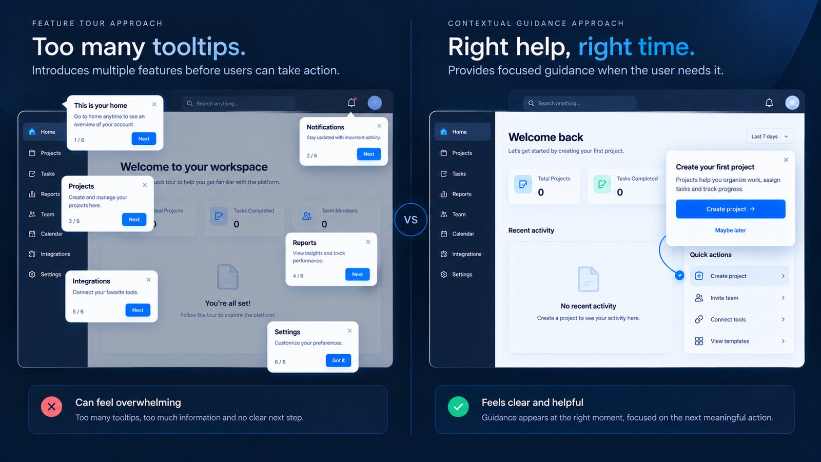
Product tours are easy to misuse. A series of tooltips may introduce the interface without helping the user accomplish anything.
Design the flow around the user’s current context rather than the complete list of product capabilities. The interface should make the next useful action understandable without requiring the user to learn the whole system first.
Practical Example
A reporting tool can show “Create your first report” beside the report-building interface instead of displaying a five-screen tutorial immediately after registration.
Senior Designer Observation
If every important feature requires a tooltip, the underlying interface may need attention. Onboarding should support usability, not replace it.
Design Recommendation
Temporarily remove the tour during review and test whether the core workflow remains understandable. If it does not, improve the interface before adding more instructional overlays.
5. Let Users Skip What Does Not Matter Yet
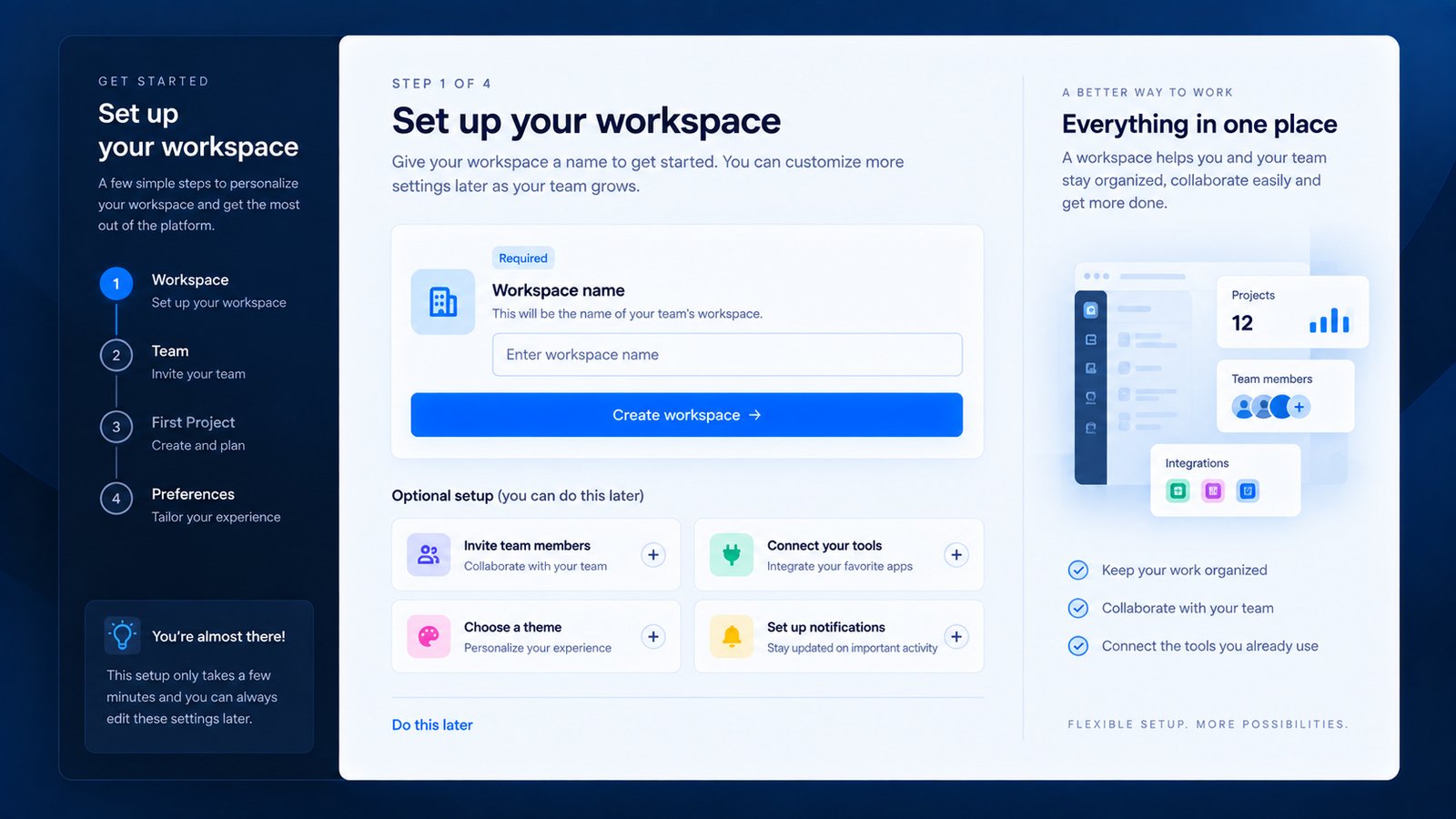
Not every onboarding task deserves to be mandatory. Giving users an escape route is often a sign of better UX rather than incomplete design.
Design the flow around the user’s current context rather than the complete list of product capabilities. The interface should make the next useful action understandable without requiring the user to learn the whole system first.
Practical Example
Make the core action primary and allow secondary setup tasks to be deferred. “Create Project” can remain the main action while “Do this later” handles optional configuration.
Senior Designer Observation
The key distinction is between required friction and avoidable friction. If a step genuinely prevents the product from working, explain why. If it does not, give the user control.
Design Recommendation
Use progressive commitment: get the user to the first meaningful outcome, introduce useful secondary setup, then surface advanced configuration when it becomes relevant.
6. Design the Empty State and Onboarding as One Journey
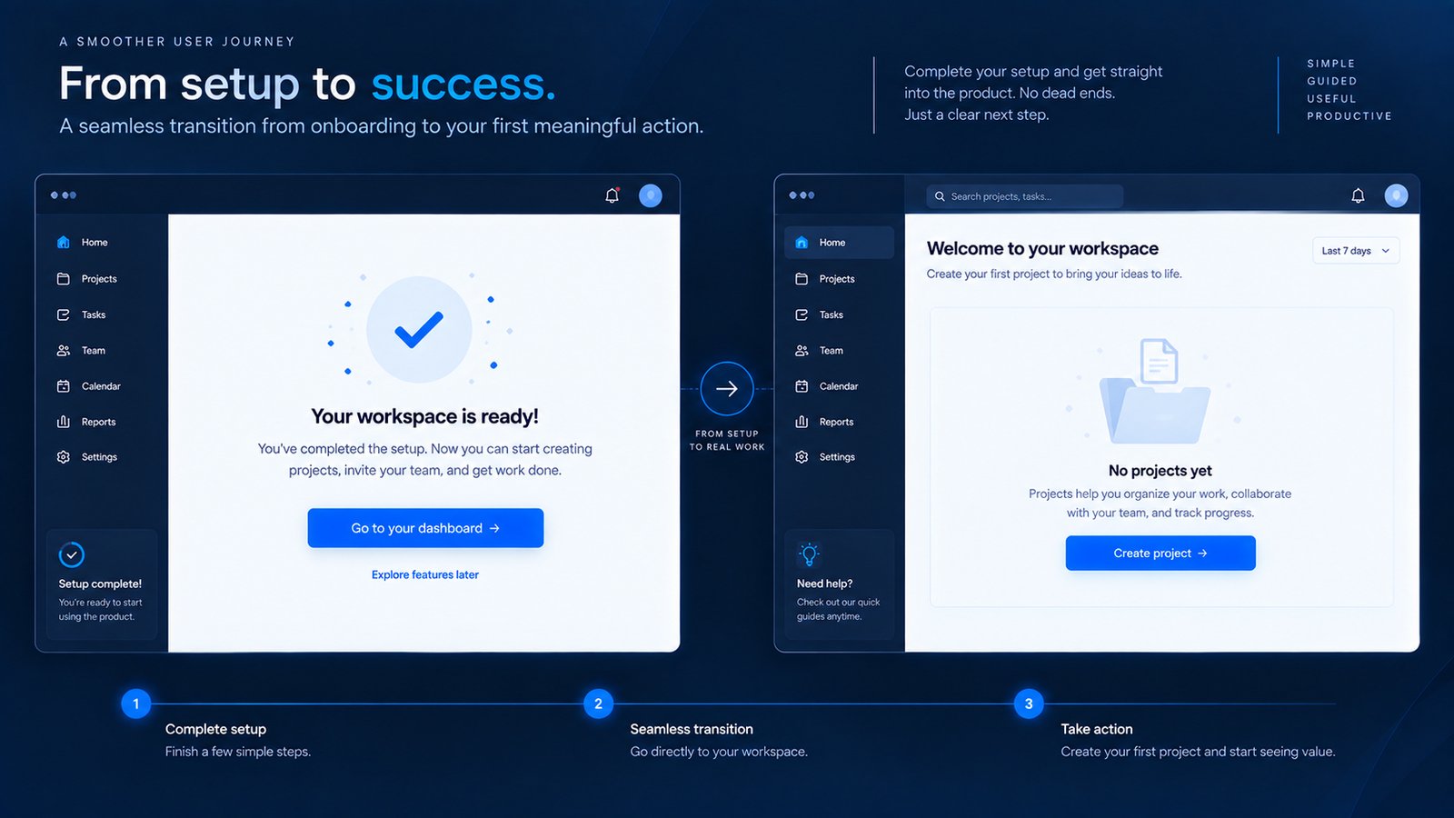
A subtle but powerful onboarding opportunity appears after the initial setup. The user may finish registration and arrive at an empty dashboard.
Design the flow around the user’s current context rather than the complete list of product capabilities. The interface should make the next useful action understandable without requiring the user to learn the whole system first.
Practical Example
“Your workspace is ready. Create your first project to see your dashboard come to life.” followed by “Create Project” turns an empty dashboard into the next onboarding step.
Senior Designer Observation
When reviewing onboarding, I map Registration → Setup → First Action → First Empty State → First Result. A break in that sequence can make users lose momentum.
Design Recommendation
Use consistent terminology, CTA hierarchy and visual language from onboarding into the main product. Onboarding should feel like the beginning of the product, not a separate mini-website.
7. Make the Mobile Onboarding Flow Feel Deliberate
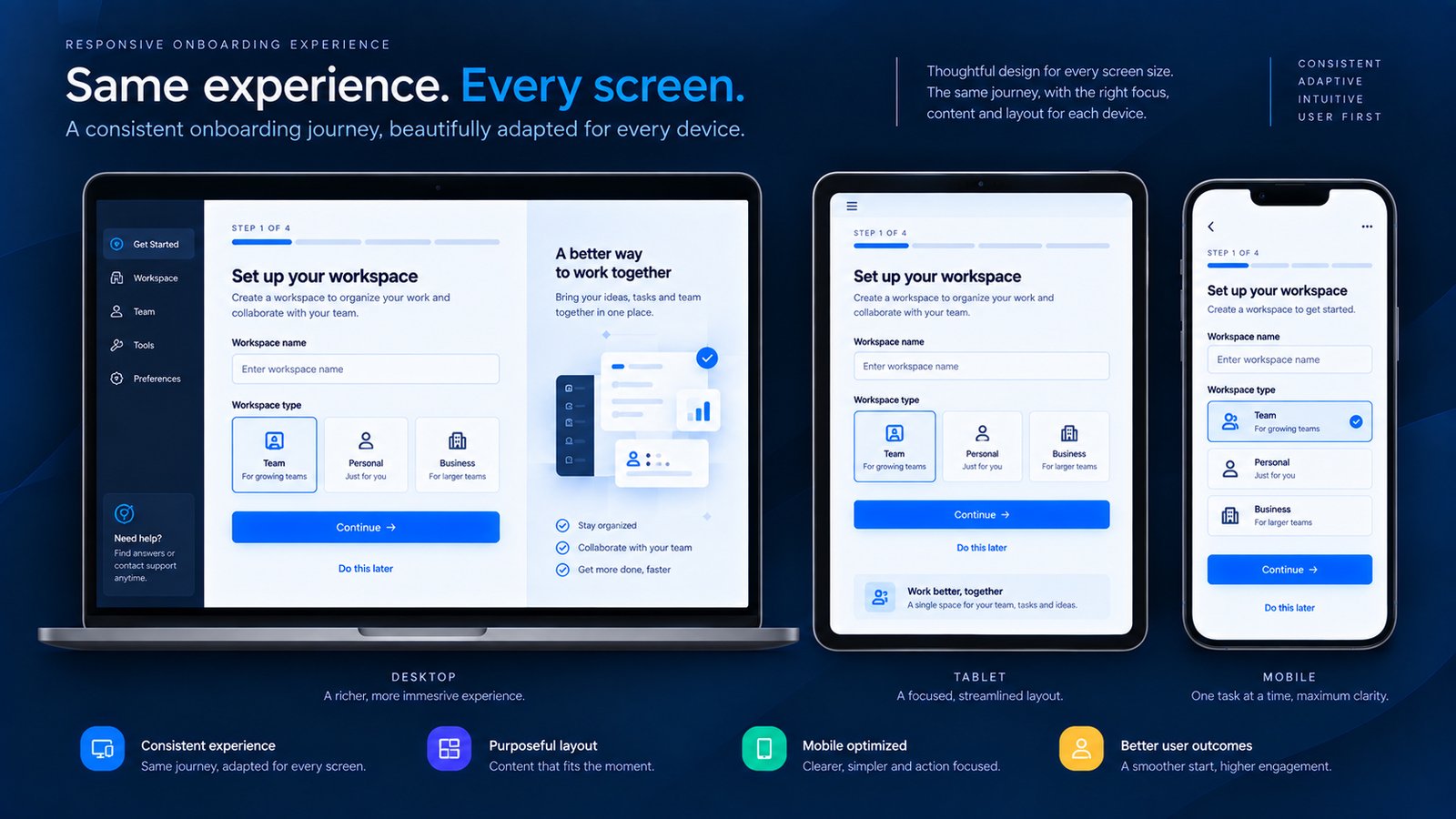
Mobile onboarding requires more than stacking desktop screens vertically. The mobile version should preserve the core decision hierarchy: What is this step? What do I need to do? What happens next?
Design the flow around the user’s current context rather than the complete list of product capabilities. The interface should make the next useful action understandable without requiring the user to learn the whole system first.
Practical Example
A two-column desktop onboarding layout can become a focused single-column mobile flow. Supporting imagery can become smaller, secondary content can move below the primary action and form controls can receive more comfortable spacing.
Senior Designer Observation
Responsive onboarding should adapt to the user’s environment, not merely to the screen width. Interrupted sessions also matter, so longer mobile flows should preserve progress reliably.
Design Recommendation
Test onboarding on real mobile interaction patterns: keyboard open, one-handed use, smaller viewport height and interrupted sessions. Preserve the task hierarchy even when the composition changes.
8. End With a Productive First Session, Not a Congratulations Screen
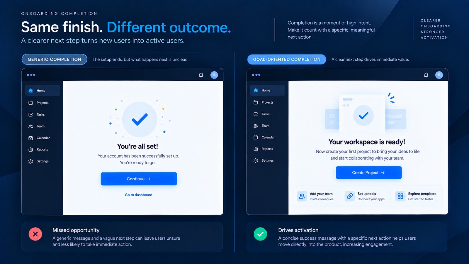
A polished completion screen can feel satisfying, but the real question is what happens next. A vague “Continue” may leave the user wondering what to do.
Design the flow around the user’s current context rather than the complete list of product capabilities. The interface should make the next useful action understandable without requiring the user to learn the whole system first.
Practical Example
“Your workspace is ready. You can now create your first project and start organizing your work.” followed by “Create Project” creates a clear bridge into actual product usage.
Senior Designer Observation
The strongest ending is not the one that says “Congratulations, onboarding is complete.” It is the one that makes the user think, “I know what to do now.”
Design Recommendation
Think of onboarding as Understand → Configure → Try → Succeed → Continue. If the user completes setup without experiencing the product’s core value, onboarding has stopped too early.
Common Onboarding UX Mistakes
- Turning onboarding into a feature catalogue: Users need a useful first experience, not a list of capabilities.
- Collecting everything upfront: Personalization can be valuable, but timing matters.
- Forcing optional setup: Mandatory configuration can create unnecessary resistance.
- Using long product tours: Instruction should appear where it helps the user act.
- Ignoring the first empty state: The main product experience should continue the onboarding journey.
- Designing only for desktop: Mobile onboarding needs its own interaction priorities.
- Ending with a dead-end confirmation: The completion screen should create momentum toward the next useful action.