Complex products often have one interface problem in common: too much information needs to be visible at the same time.
Tables are usually the answer because they let users scan, compare, sort, filter, and act on structured information efficiently. But a table can also become one of the most difficult interfaces to design well.
The challenge is not simply fitting more rows and columns onto a screen. It is creating a visual system that helps users understand what matters, maintain context, and make decisions without unnecessary friction.
For dashboards, SaaS products, admin systems, CRMs, analytics tools, and operational platforms, table UX can have a direct effect on how professional and trustworthy the product feels.
In my design work, I treat a table as a decision-making interface rather than a spreadsheet dropped into a UI. Hierarchy, density, column selection, comparison, filtering, responsive behavior, accessibility, and interaction patterns all need to support the same user goal.
Here are eight UX decisions I would prioritize when designing data tables that feel dense enough to be useful, but clear enough to work.
1. Give Dense Information a Clear Reading Order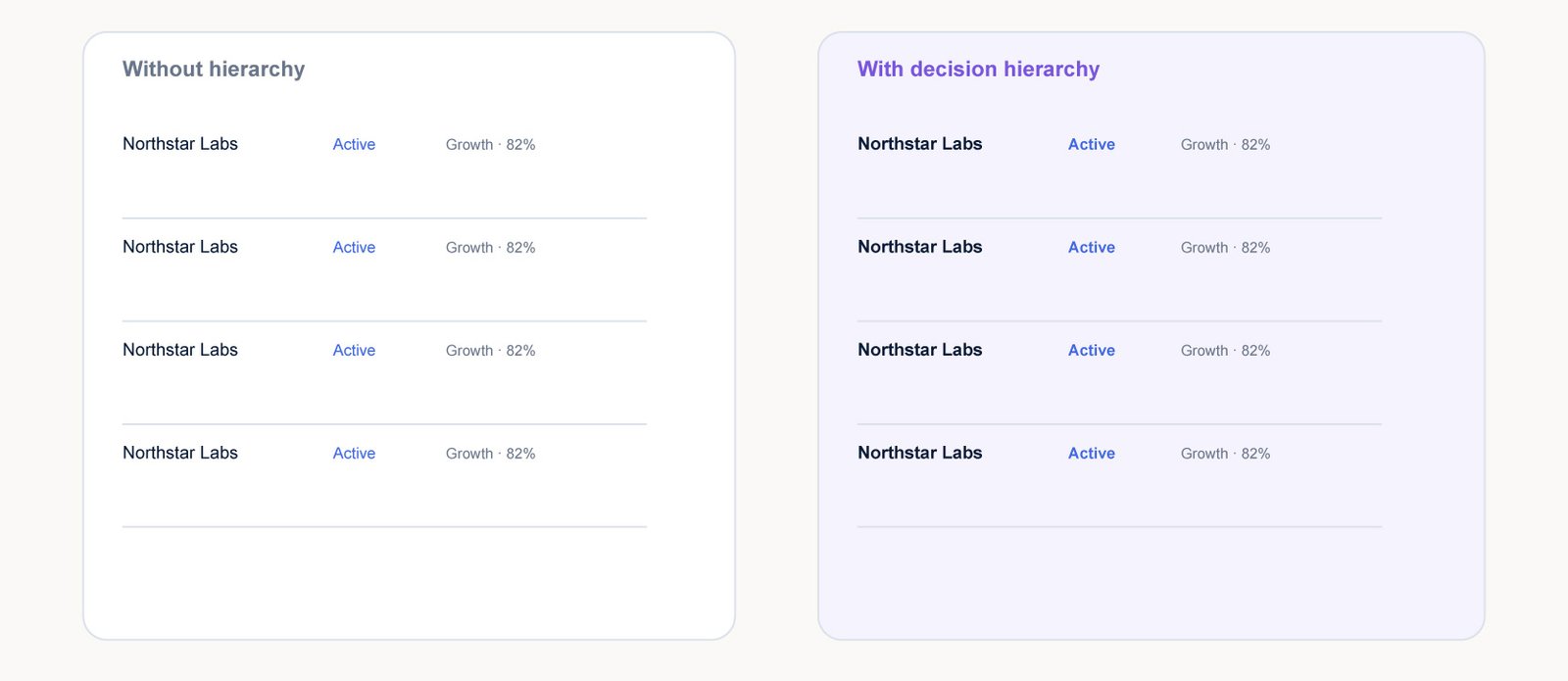
A data table can contain useful information and still feel difficult to use. The problem is often not the amount of data; it is the absence of a clear reading order.
Start by deciding which information is primary, which information supports the decision, and which information is only useful occasionally. The primary field should receive the strongest visual emphasis, while secondary metadata can be quieter.
I prefer to design tables around the user’s decision rather than around the database schema. The question is not “What fields do we have?” It is “What does the user need to notice first?”
2. Choose Density Based on the Task
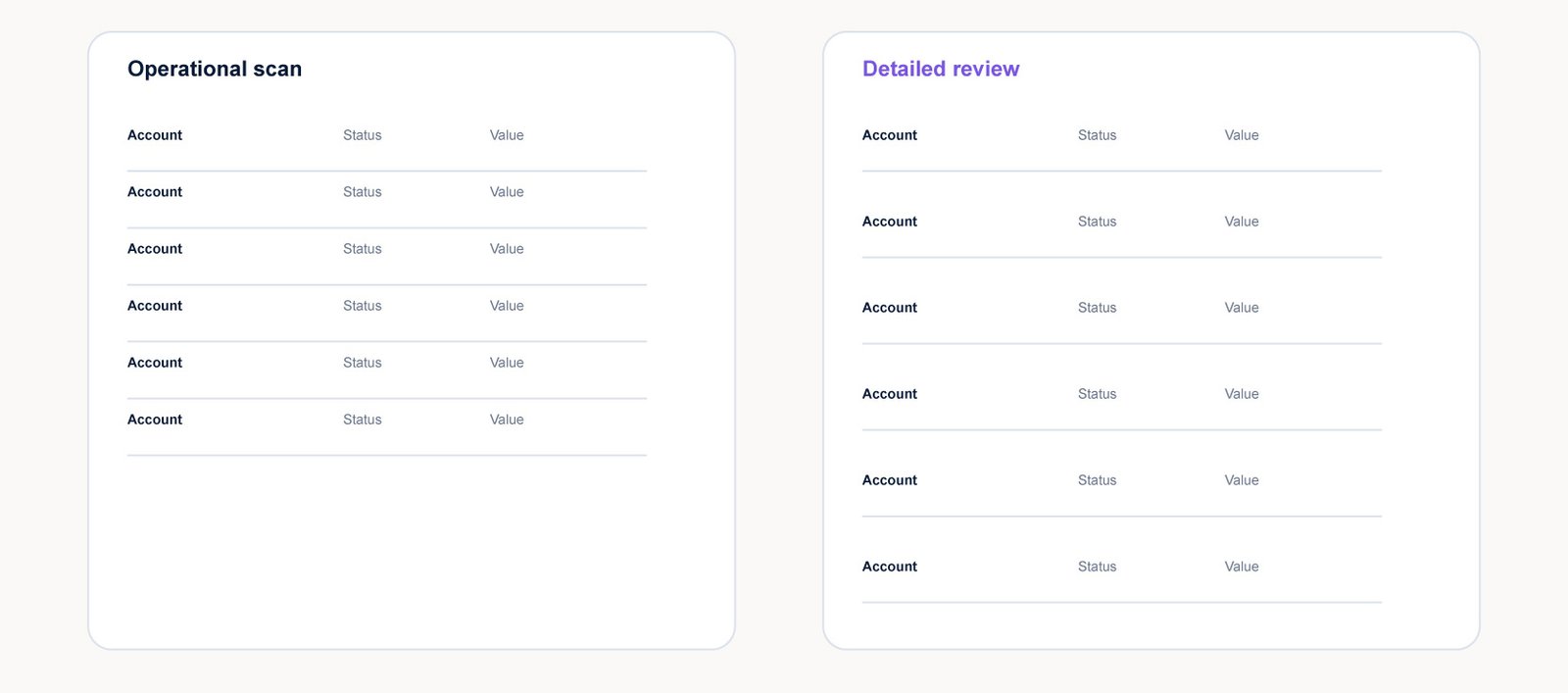
Tables often need to display more information than cards or marketing layouts. That does not mean every row should be squeezed into the smallest possible height.
Frequent operational tasks can benefit from compact rows because users need to see more records at once. But compactness needs breathing room around headings, filters, grouped areas, and major actions.
The important distinction is between information density and visual pressure. A dense table can still feel calm when spacing is predictable and the interface gives users clear boundaries.
3. Show the Columns That Help the Decision
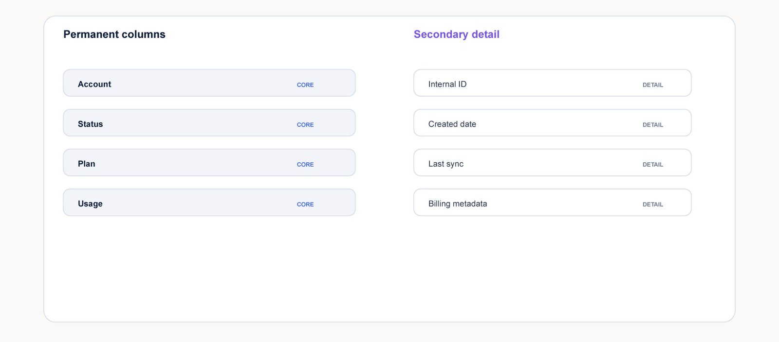
One of the fastest ways to make a complex table feel simpler is to question every column.
A field may be valuable somewhere in the product without being valuable in the primary table view. If a column rarely changes a user’s decision, it may belong behind a column selector, detail drawer, or secondary view.
The goal is not to hide useful information. It is to put the right information in the right place.
4. Design for Side-by-Side Comparison
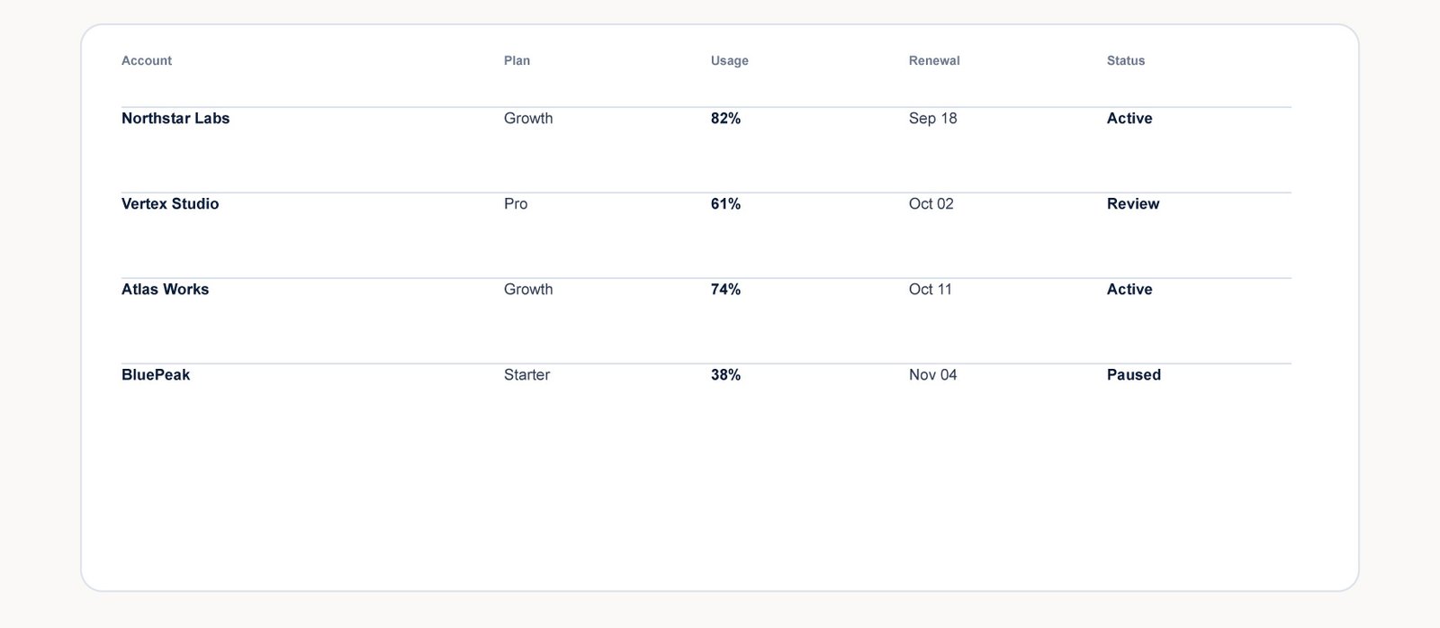
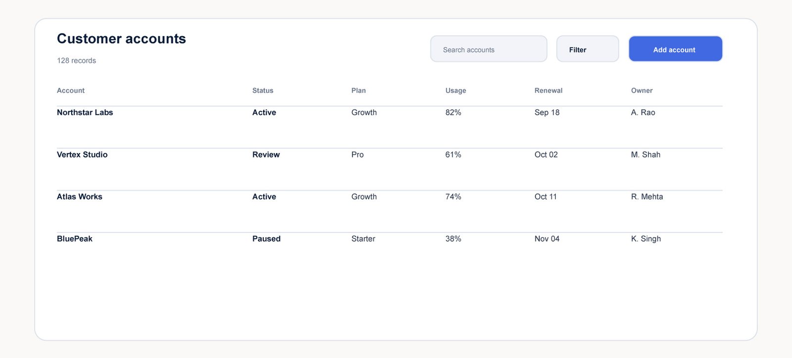
Many table tasks are comparative. Users may be checking account health, comparing plans, reviewing dates, looking for the strongest values, or identifying records that need attention.
That makes alignment extremely important. Related values should sit in predictable positions so the eye can move horizontally without searching for each field.
Consistent formatting also matters. Dates should follow one pattern. Statuses should use the same visual language. Numerical values should align in a way that makes differences easy to spot.
5. Make Filtering Feel Reversible
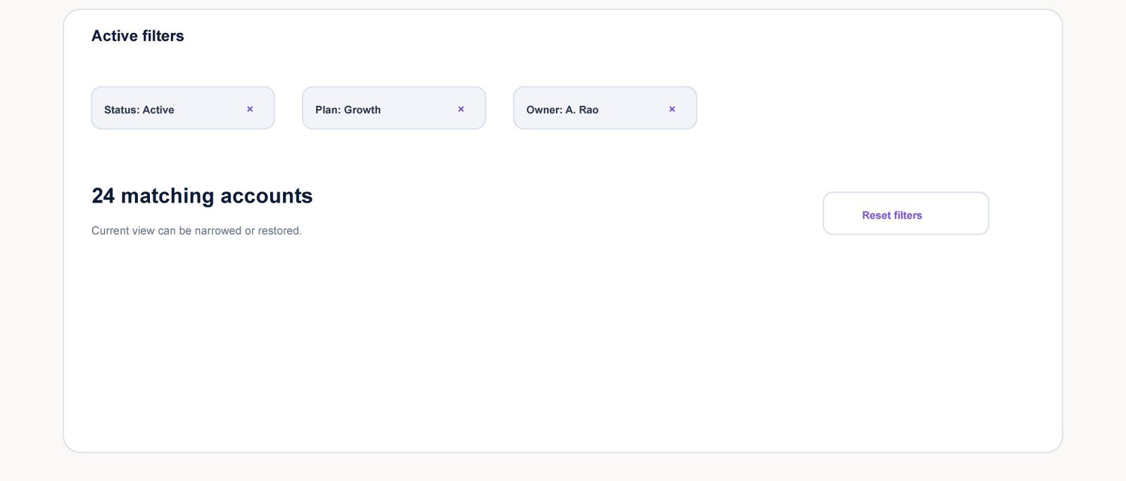
Filtering is powerful because it lets users reduce a large dataset to something manageable. It becomes frustrating when users cannot tell which filters are active or how to return to the broader view.
Keep active filters visible. Give users an obvious way to remove one condition without clearing everything.
I think of filtering as a reversible operation. Every narrowing action should have a clear recovery path.
6. Adapt the Table to the Device
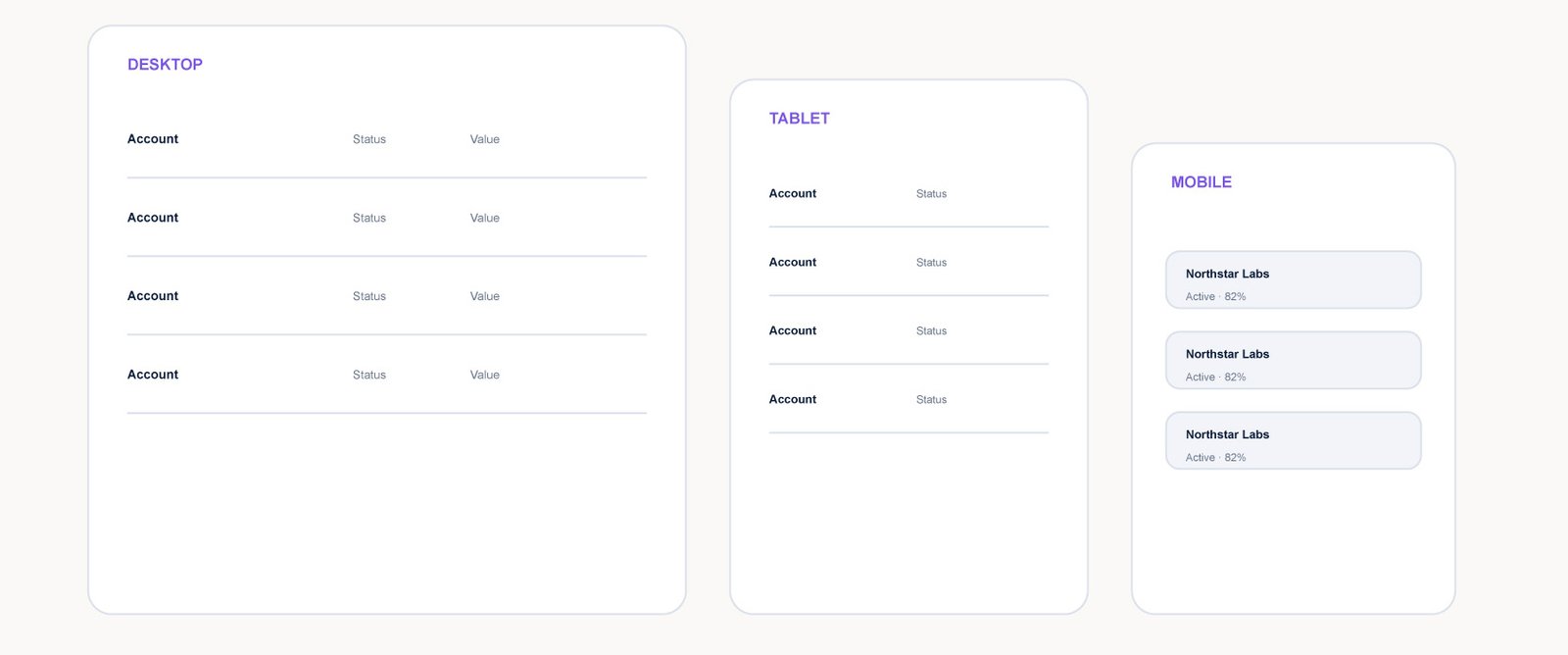
Tables are one of the clearest examples of why responsive design cannot simply mean making everything smaller.
On a narrow screen, trying to keep every column visible usually creates tiny text, horizontal friction, or both. A better approach is to decide which information is essential to the mobile task and reorganize the rest.
A mobile table does not have to look identical to the desktop version. It has to support the same underlying job with a better information hierarchy.
7. Do Not Make Color Carry the Whole Meaning
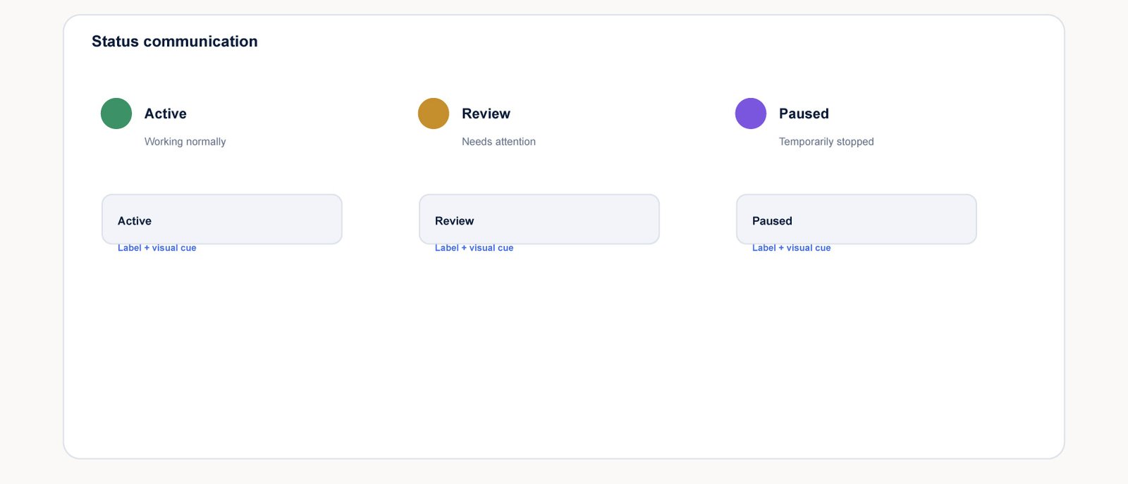
Color can be an excellent supporting signal in a table, but it should rarely be the only signal.
If active, review, and paused states are represented only by different colors, users may lose important meaning when color is hard to distinguish or when the interface is viewed in a different context.
Use labels, icons, text hierarchy, and consistent structure alongside color. The goal is not to remove color. It is to make the information understandable without depending on it.
8. Make Row Actions Predictable
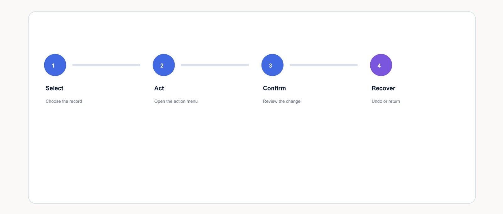
Tables often combine several interaction models. Users may select rows, open a record, edit inline, reveal actions, or perform bulk operations.
Without a clear model, users can hesitate before clicking because they are unsure what a row click will do or whether an icon affects one record or many.
Define a predictable relationship between selection and action. If checkboxes enable bulk actions, make that relationship visible. If row clicks open details, keep secondary actions visually distinct.
Key Takeaways
- Design table hierarchy around the user’s decision, not the database schema.
- Balance information density with enough spacing to preserve calm and scanability.
- Keep permanent columns focused on fields that repeatedly support the task.
- Align and format related values consistently for faster comparison.
- Make filtering visible, understandable, and reversible.
- Redesign table information for mobile instead of shrinking the desktop table.
- Use labels and structure alongside color so meaning remains accessible.
- Make selection, row actions, bulk actions, confirmation, and recovery predictable.
FAQ
What makes a data table good UX?
A strong data table has a clear reading order, useful columns, consistent alignment, appropriate density, understandable filtering, and predictable interactions.
How many columns should a table have?
There is no universal number. Permanent columns should earn their visibility by helping users repeatedly make decisions.
Should data tables be responsive?
Yes, but responsive should not mean simply shrinking every column. On smaller screens, prioritize essential information and consider stacked records, expandable details, or controlled horizontal scrolling where appropriate.
Are colored status indicators accessible?
They can be, but color should not be the only way to communicate meaning. Pair color with text labels, icons, or structural cues.
How should table actions be designed?
Actions should have a predictable relationship to selection and rows. Users should understand whether an action affects one record or many, with confirmation or recovery when appropriate.