Search is one of those product interactions that looks simple until users depend on it.
A good search experience can help someone find a customer, document, project, task, product, or answer without forcing them to understand the entire structure of the product first.
But search UX is more than adding an input field and displaying matching results. The quality of the experience depends on how well the interface understands intent, guides queries, communicates relevance, handles failure, supports refinement, adapts to different screens, and remains accessible.
In information-heavy products, search can become one of the fastest paths to value. When it is designed thoughtfully, it reduces unnecessary navigation and helps users move directly toward the work they came to complete.
Here are eight search UX decisions I would prioritize when designing websites, SaaS products, dashboards, and other digital experiences.
1. Start by Understanding Search Intent
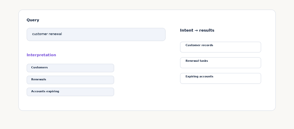
A search field is deceptively simple. A user types words, but those words usually represent a larger goal.
For example, “renewal” could mean a customer list, a report, an upcoming task, or an account that needs attention. Designing search only around matching text can therefore produce technically relevant results that are still practically unhelpful.
Before designing the results interface, identify what users are trying to accomplish. Search intent can often be grouped into actions such as finding a specific record, exploring a topic, locating a document, or completing a task.
I prefer to map these intents before deciding how results should look. Once the goal is clear, the interface can prioritize the information and actions that help users move forward.
Good search UX is not simply about finding a word. It is about helping users find the right thing for the job they are trying to complete.
2. Treat the Search Input as a Primary Interaction
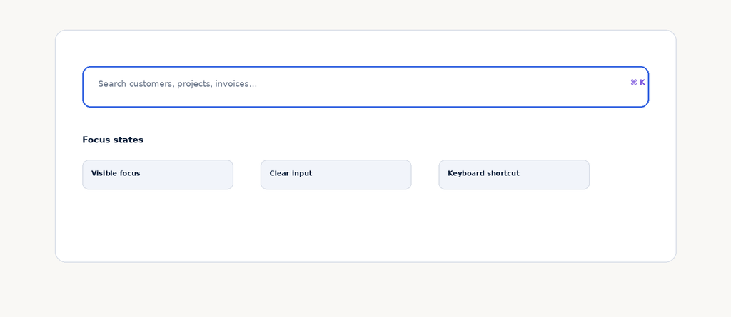
The search input is often one of the most important controls in an information-heavy product, yet it is frequently treated as a decorative field placed at the top of a page.
Make its purpose obvious. Use a useful placeholder, a recognizable search affordance, and a visible focus state. If keyboard shortcuts are supported, make that discoverable without overwhelming the field.
Do not rely on placeholder text to communicate essential instructions. The field should remain understandable after the user begins typing.
Search should also feel immediate. The interaction between focusing the field, entering a query, viewing suggestions, and reaching results should feel like one connected experience rather than separate components.
3. Use Autocomplete to Help, Not Distract
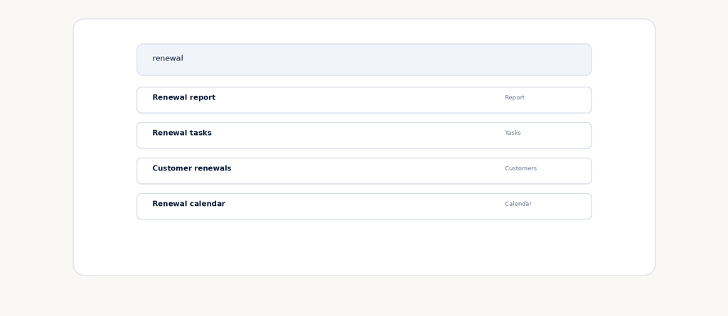
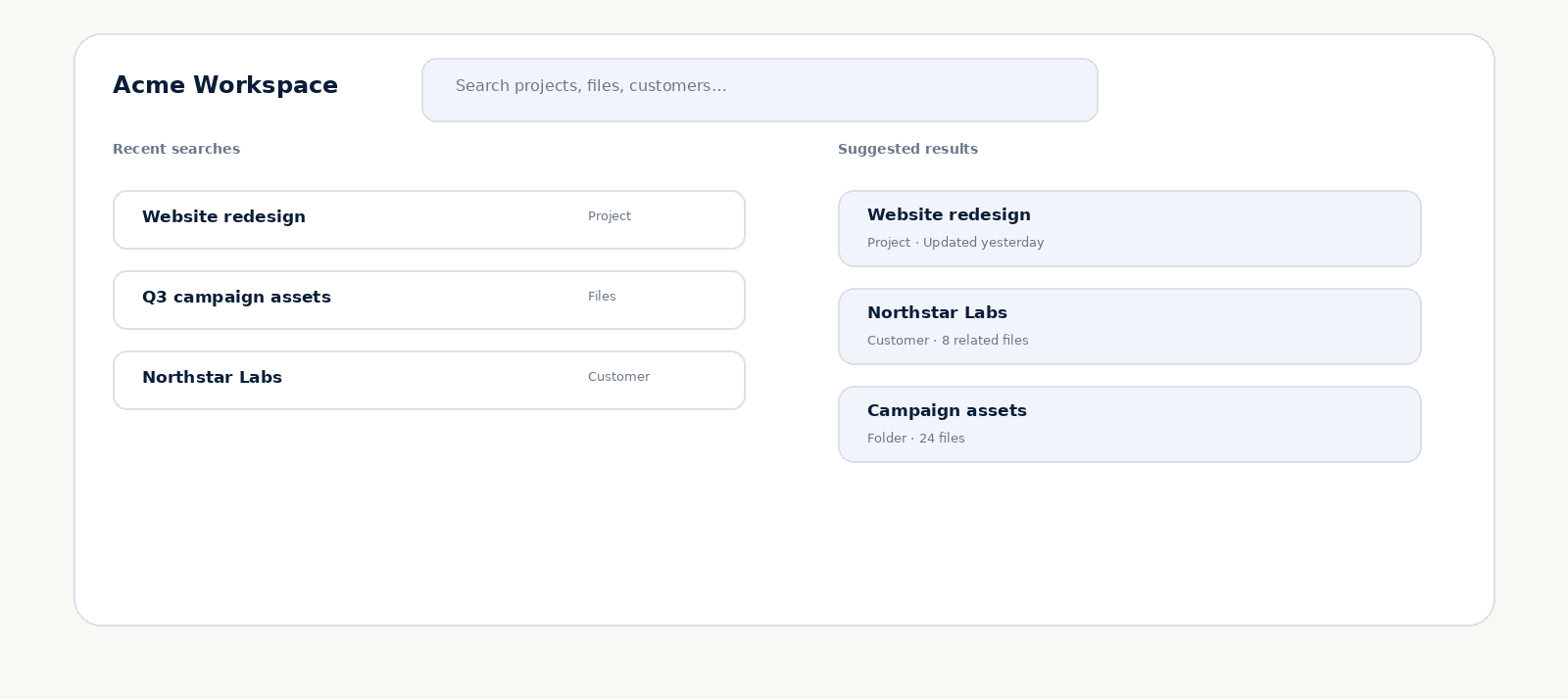
Autocomplete can be extremely useful when users search for known entities, common tasks, or frequently used phrases.
The important part is relevance. Suggestions should help users complete the thought they are already typing rather than presenting a long list of unrelated possibilities.
Group suggestions when the product contains different content types. A customer, report, task, and calendar item may all match the same words, but the labels help users understand the difference.
Keyboard navigation should work naturally with suggestions as well. Users should be able to move through the list and select an option without abandoning the keyboard.
4. Make Search Results Easy to Evaluate
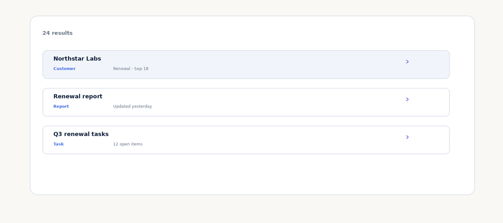
A list of matching titles is rarely enough for complex products. Users need context.
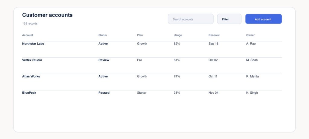
Show the information that distinguishes one result from another. Depending on the product, that could be content type, owner, date, status, project, or another meaningful attribute.
Hierarchy matters here. The result title should be easy to scan, while supporting metadata should remain visually quieter.
I also recommend making the relationship between the query and the result understandable. Highlighting useful matching terms can help, but the interface should never become visually noisy.
The objective is simple: users should be able to evaluate a result before spending another interaction opening it.
5. Turn Zero Results Into a Next Step
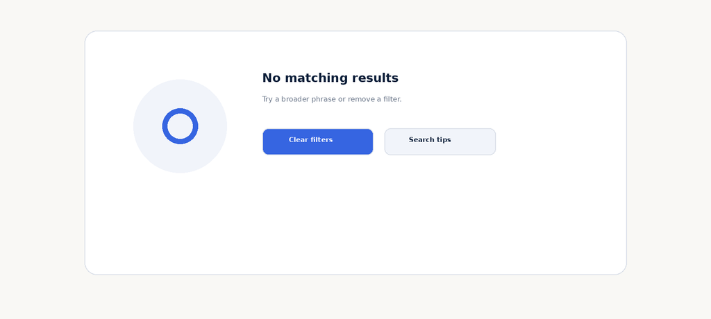
No-results states are often treated as failures. In reality, they are an important part of search UX because every search system will eventually encounter an unsuccessful query.
Do not simply display “No results found.” Explain what happened in plain language and offer a useful recovery action.
That might mean clearing filters, broadening the search, checking spelling, or exploring related content.
The correct recovery action depends on the reason for the empty state. If filters are responsible, make them visible. If the query is too specific, suggest a broader approach.
A thoughtful zero state turns a dead end into guidance.
6. Add Refinement Without Losing Context
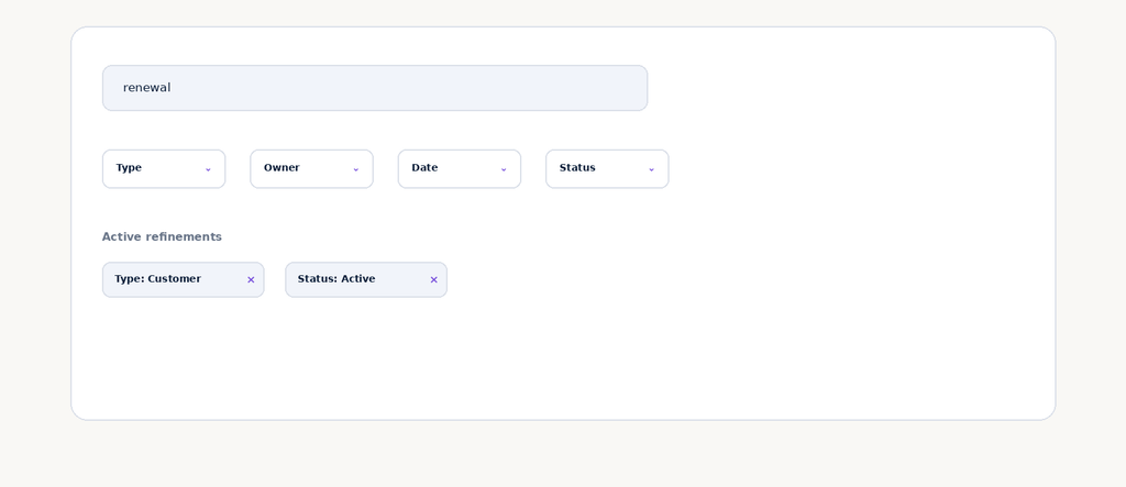
Search and filtering often work together. Search identifies a broad intent, while filters help users narrow the result set.
The risk is creating a complicated refinement system where users no longer understand why particular results are visible.
Keep active filters visible and make them easy to remove individually. Preserve the original query so users can see how their search and refinements relate.
Filters should feel reversible. Users should be able to experiment with narrowing the dataset without worrying that they have permanently changed their search context.
7. Design Search for the Screen, Not Just the Desktop
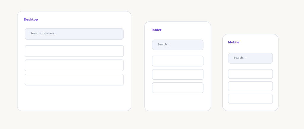
Search patterns that work beautifully on desktop can become awkward on smaller screens if they are simply scaled down.
On mobile, the search field may need to become more prominent, occupy its own row, or open into a focused search experience. Suggestions may need a different presentation because there is less room for surrounding navigation.
The principle is similar to other responsive interfaces: preserve the task, not necessarily the desktop composition.
If finding a customer is the goal, the mobile experience should make that task fast even if the surrounding layout is substantially different.
8. Make Search Fast and Accessible
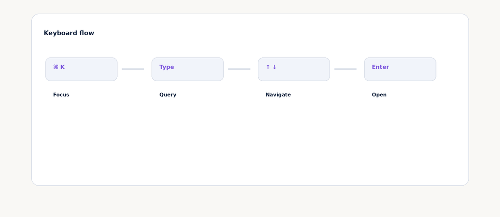
Search is an interaction where keyboard support can make a noticeable difference, especially in productivity and SaaS products.
Users should be able to focus search, enter a query, navigate suggestions, and open a result without being forced to switch between keyboard and pointer unnecessarily.
Focus states should remain visible. Interactive suggestions should have understandable labels and states. The search field itself should have an accessible name rather than depending only on placeholder text.
Accessibility also improves efficiency. A well-designed keyboard flow is not just an accommodation; it can become a faster path for experienced users.
Search should feel like a reliable command surface, not a fragile collection of disconnected controls.
FAQ
What is search UX design?
Search UX design is the process of designing how users enter queries, receive suggestions, evaluate results, refine searches, recover from unsuccessful searches, and complete their intended task.
What makes a good search experience?
A good search experience makes the search action obvious, understands useful intent, provides relevant suggestions and results, communicates context, and gives users a clear recovery path when nothing matches.
Should every website have search?
Not necessarily. Search is most valuable when users have a meaningful amount of content, products, records, or information to locate.
How should zero-result pages be designed?
Explain why the search produced no useful result and offer an appropriate next action, such as clearing filters, broadening the query, checking spelling, or exploring related content.
How can search be made accessible?
Provide a clear accessible name for the search field, visible focus states, keyboard support, understandable suggestion states, and a predictable keyboard path through results.
UI/UX Design, SaaS/Product Design, Dashboard UX, Web Design, Figma/Design Systems, Responsive Web Design, UX Audit, Accessibility, Portfolio/Case Studies, and Contact / Start a Project.