Whether you’re designing a brand, an app, or a living room, understanding color theory can take your work from average to extraordinary. This blog explores the essential elements of color theory for designers, paired with visuals to inspire your creativity.
The Basics of Color Theory
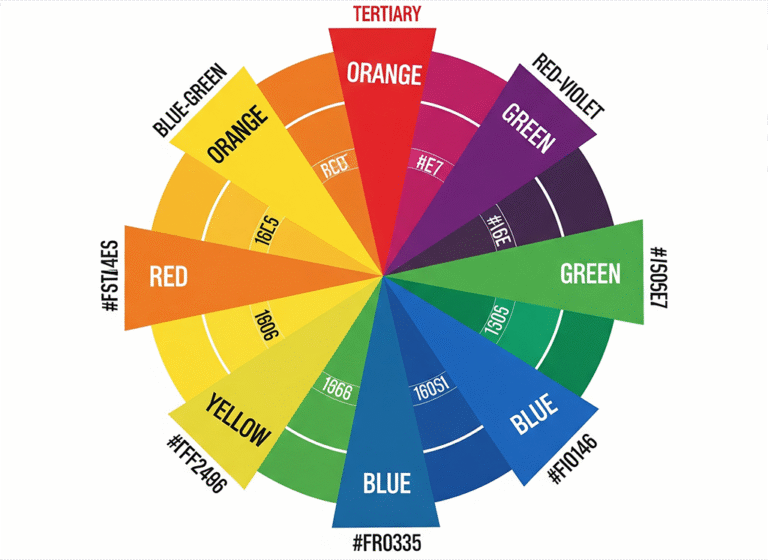
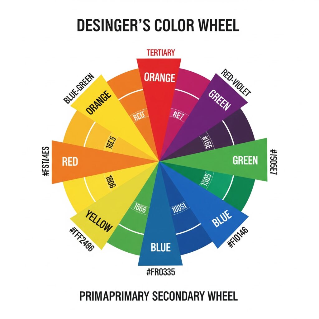
At the heart of color theory is the color wheel, a visual representation of colors arranged by their chromatic relationship.
Primary Colors
- Red
- Blue
- Yellow
Secondary Colors
- Green (Blue + Yellow)
- Orange (Red + Yellow)
- Purple (Red + Blue)
Tertiary Colors
These are made by mixing a primary and a secondary color (e.g., red-orange, blue-green).
Psychological Impact of Color
Different colors evoke different emotions:
- Red: Passion, urgency, power
- Blue: Trust, calm, professionalism
- Yellow: Optimism, energy, warmth
- Green: Growth, balance, freshness
- Purple: Luxury, creativity, mystery
- Black & White: Sophistication, minimalism, clarity
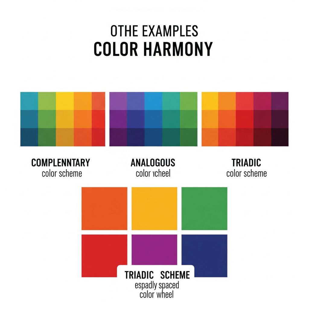
Color Harmony & Palettes
Designers use color harmonies to create pleasing visuals. Popular combinations include:
- Complementary (opposites on the color wheel): e.g., blue & orange
- Analogous (next to each other): e.g., blue, teal, green
- Triadic (three colors evenly spaced): e.g., red, yellow, blue
Tools like Adobe Color and Coolors can help you generate palettes easily.
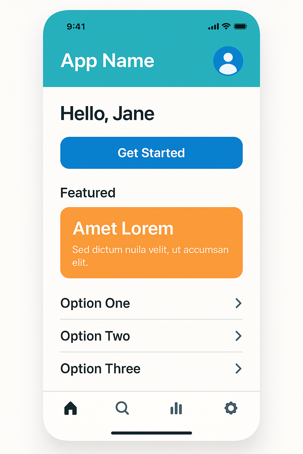
Color in UI/UX Design
In digital design, color isn’t just for decoration—it improves usability:
- Contrast ensures readability
- Hierarchy draws attention to key elements
- Brand identity is reinforced through consistent color use
🧪 Pro Tips for Designers
- Always test colors on different screens and lighting conditions.
- Use accessible color contrast ratios (check with tools like WebAIM).
- Stick to 2-3 main colors and use tints/shades for variety.